Welcome to Cognitive Ink’s Fieldnotes
A behind-the-scenes look into our practical observations of life, work, society and everything in between. Our fieldnotes are made for curious people who like bite-sized inspiration. It’s going to be full of new ways of looking at things, forgotten facts, curious insights and little pieces of everyday life, annotated. We’re full-time ethnographers, which means that we’re good at picking up the interesting side of things wherever we are. We hope, in time, this will become a varied quilt of ideas.
70% of Innovation Transformations Fail
It’s optimistic to think that all software, technology, innovation, and transformation projects intended to improve an organisation actually deliver their outcomes. After all, significant time, effort, and money are spent to make an organisation, or its products, services, and experiences, higher performing, efficient or more valuable. But after decades of observation, ~70% of transformation projects still fail to deliver their intended value. And the common reason they fail is because teams keep misunderstanding the Human Factor.
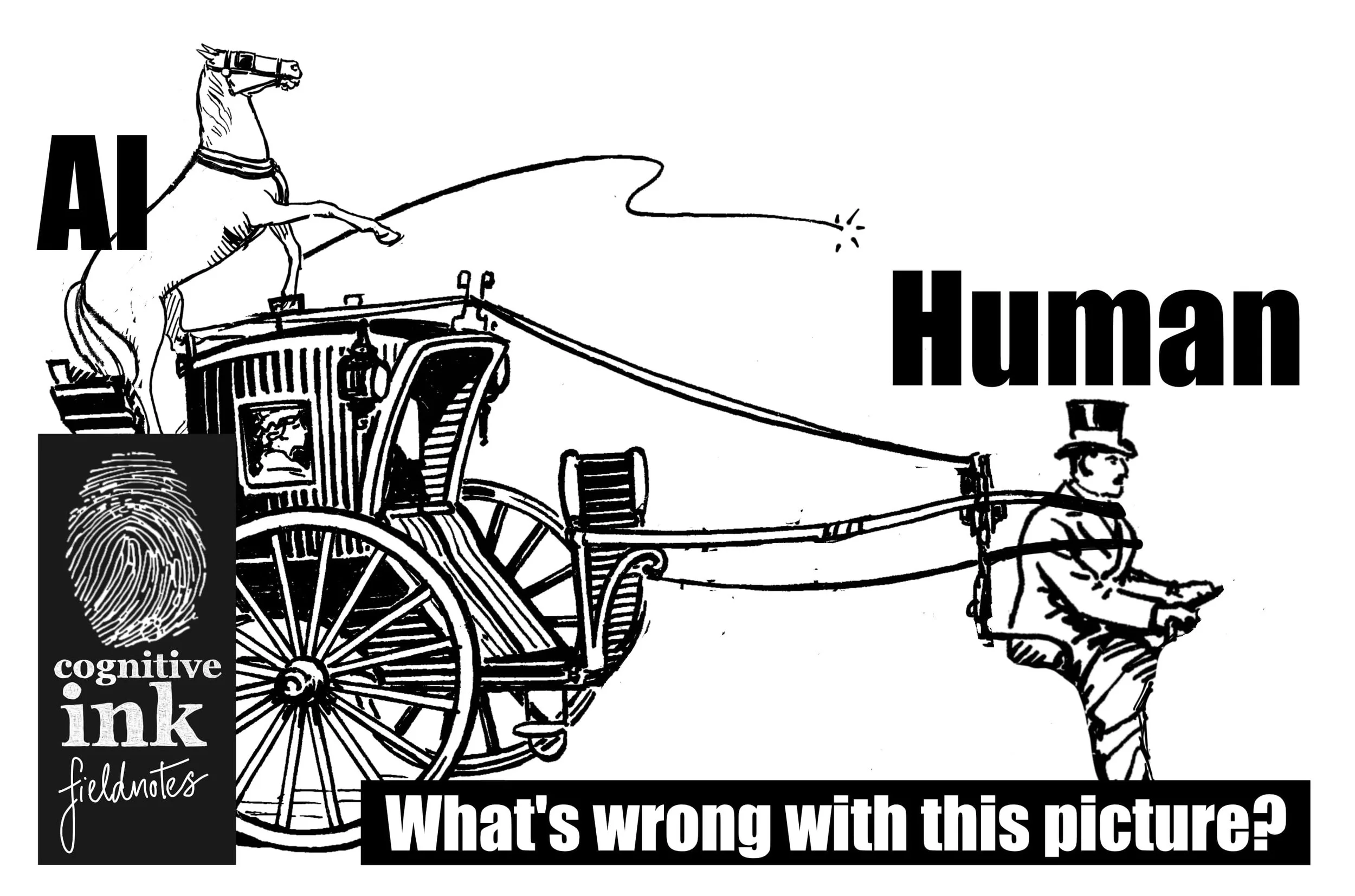
Don’t put AI in the Driver’s Seat of a Human Centred Design Project
If AI is the horse, the thing meant to do the work, then they should pull the cart, to wherever the driver specifies, not the other way around. The way to thrive, with a Human-Centred Design lens is to understand the human, system and organisational problems and solve outward to the technology. That way we can build the sort of future where organisations and the people they serve, both benefit.
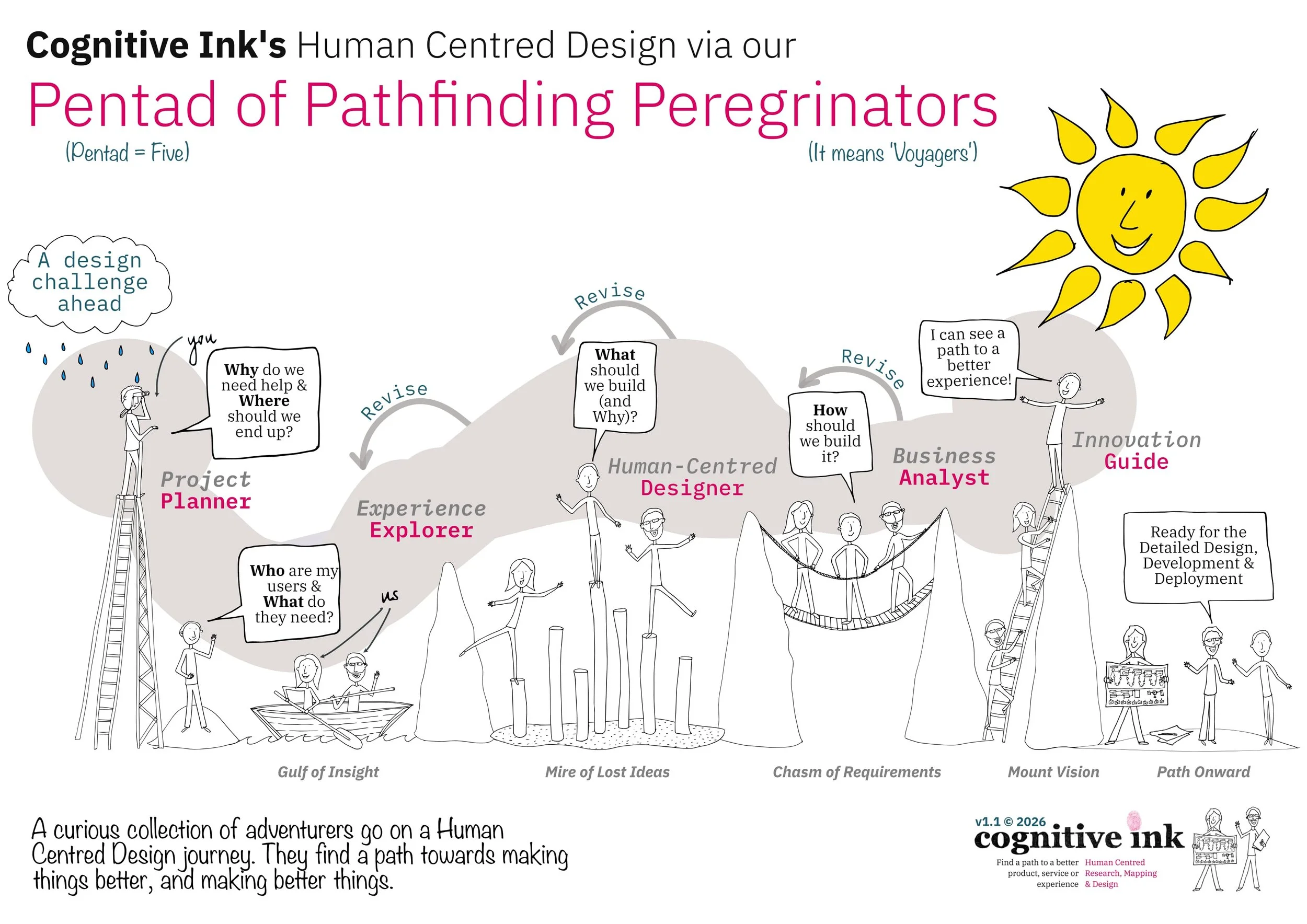
Cognitive Ink’s Human Centred Design via our Pentad of Pathfinding Peregrinators
Some years ago, we got the idea to think about Human Centred Design, not as a sequence of steps, stages or phases of activity, but as a set of characters in an epic story of design adventure.

The Humble Flowchart, Time-worn but Clarifying
Experience mapping, in all its forms, is a key stock-in-trade for Cognitive Ink. Over the years, we’ve accumulated many dozens of mapping techniques. Yet, for many reasons, we keep circling back around to the humble, time-worn and clarifying flowchart.
Cognitive Ink’s Human Centred Design Principles
It’s easy to get overwhelmed by the number of product, service and experience design principles that pervade the world. Some are very specific to lower-level concerns, like principles of grouping, to make interfaces easier to comprehend. Others are more abstract, like how we should ‘sail towards Blue Oceans,’ to find products and services that are radically new business areas.

Designing the Heart of Your Product, Service or Experience
Have you ever felt that you’re not getting the core—the heart—of your product, service or experience, right?
What Are You Measuring?
In an urgency to do human centred research work, it’s easy to jump right into action, throwing money and time at setup, recruitment, staging and then the actual interviews, workshops, on-sites, surveys or analytics that form the backbone of qualitative and qualitative research practices. But it’s worth asking first, ‘What are you measuring?’

Finding The Secret Stories Of How Things Work
Whether it’s explaining a past challenge, or presenting a better future, it comes down to taking to time to find the secret stories of how things work.
Synthetic Users and Why We Talk With Real People When Doing User Research
There are a lot of forces, some recent and some historical, that work against talking with real people during user research. The rise of synthetic users is the most recent and perhaps the most powerful. But even when considering the apparent efficiency and cost-effectiveness of synthetic users, we still advocate talking with real people.

Tabulating The Top 12 Benefits of Visual Product, Service and Experience Mapping
Suppose you’ve reached the point where you’re interested in visually mapping your product, service, or experience. Yet, you or a person in power might ask, before committing fully to a mapping adventure “What benefit does all this visual committing mapping bring?”
Looking for something a bit more?
Dip into one of the hundreds of articles available on Christopher’s psychology, history, design and technology blog, Adventures in a Designed World. Here’s a few interesting samples…