The Humble Flowchart, Time-worn but Clarifying
Experience mapping, in all its forms, is a key stock-in-trade for us. Over the years, we’ve accumulated many dozens of mapping techniques. Yet, for many reasons, we keep circling back around the humble, time-worn-but-clarifying Flowchart.
Maybe we’ll be judged for saying it, especially in the face of all the more visually spectacular experience maps that make sense of a product, service or experience.
But we have a fondness for flowcharts.
Yes, flowcharts.
With their start and end points, process boxes, decision diamonds and other formal arcane symbology.
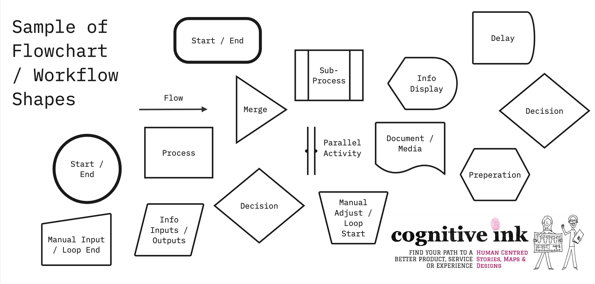
Sometimes known as ‘business process models’ or ‘workflows’, flowcharts do what their name implies; helping us visualise the flow of work.
The topic of flowcharts came up during a recent onsite project for a client with many complex business processes, both internal and customer-facing, situated across different business functions.
Client-side leaders had spent some time making sense of the business, using a variety of techniques. However, there was a concern that undocumented work process continued to happen, ‘beneath the surface’, masking what was really happening in the organisation.
The team didn’t want to paper over those cracks and fissures with tactical process, people and technology patches. In order to create a better employee and client experience, they needed to get a wide and deep look at what work the business was doing.
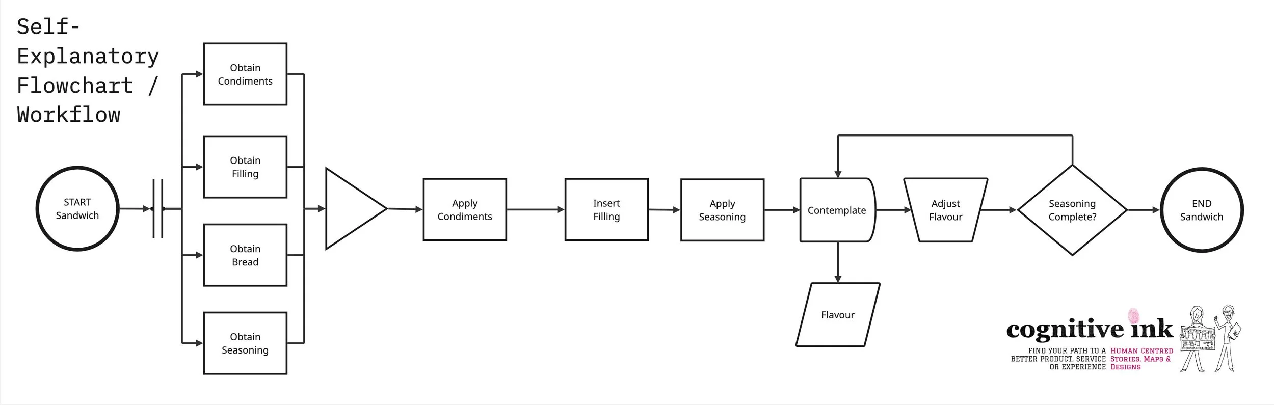
This meant the most useful mapping technique turned out to be the practical, quick to assemble, unadorned and technical … flowcharts.
As an aside, flowcharts (workflows) are one of the thinking tools included by Kaoru Ishikawa (of Ishikawa ‘Fishbone’ roots cause analysis diagrams) in the ‘seven tools of quality control’. And, as far as I’m aware, the first to formalise a flowchart language were the process-obsessed power-duo Lillian and Frank Gilbreth, in a presentation in 1921 to the American Society of Mechanical Engineers.
At Cognitive Ink, we use a pseudo-formal approach to flowcharts, borrowing elements, but not using the formal symbols offered by IBM, the American National Standards Institute (ANSI) and the International Standards Organisation (ISO).
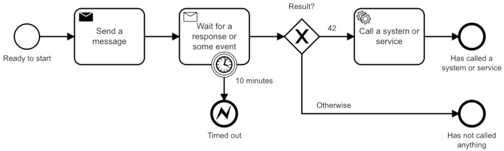
We’ve occasionally used the BPMN language (Business Process Model and Notation), which is a little more advanced in its thinking. But it’s also a lot more complicated to deploy.
We find the standard shapes show up more often in a range of tools, making it easy to draw flowcharts in a way that is tool agnostic.
Perhaps these simple little boxes seem old-fashioned. A little stodgy compared to more colourful or scintillating product, service or experience models.
Who can deny even a well-constructed workflow can end up in a bit of visual and cognitive nightmare? Especially when multiple process, decisions and loops interact in such a way that it becomes near impossible to follow the spaghetti tangle.
Despite this, flowcharts remain useful.
It’s about choosing the right map for the job.
Each map will have its own implications, its own way of shaping how you think about problems and solutions. Flowcharts are just another ‘scaffold for thinking.’ A way to see a complex task visually.
Flowcharts suits products, services or experiences that have significant legislative requirements, multiple dependent steps, risky execution, long chains of responsibility or outputs that are very sensitive to the quality of the inputs.
There are some tasks where you don’t want imaginative variation in the series of steps within a process. Or, you don’t want variation in how different processes hand off to each other.
Granted, flowcharts are less useful for truly giant task or task-sets. In that case, we have to resort to extensive sub-processes and sub-sub processes to keep everything tidy and it can all get unwieldy.
Sometimes hybrid models might be called for.
Like using a semi-linear product, service or experience journey as the ‘spine’ and then dangling little bits of flowchart off that spine to make sense of specific tasks or functions. Would that make the workflows the ribs? The metaphor is probably breaking down at this point.
Flowcharts are not a panacea. Nothing is. Flowcharts can be difficult to read and therefore take a great deal of work to make clear. They can also be difficult to update. Adding a few shapes can require a ‘re-ploughing’ of all the shapes until order is regained.
These updating challenges can lure teams into an endless, and somewhat reductive exploration of an abstract and hyper-real workflow in place of actually understanding the tasks carried out in context. The classic trap of improving the model beyond reality.
With these warnings in mind, when faced with understanding a complex existing or new products, service or experience, you might still benefit from reaching towards your box of flowchart shapes.
(Or, you can reach out, and we can do some mapping together).
Either way, enjoy untangling that process.
References
BPMN Models by Camunda GmbH, 2021, CC BY-SA 4.0 <https://creativecommons.org/licenses/by-sa/4.0>, via Wikimedia Commons via https://commons.wikimedia.org/wiki/File:Camunda-platform-bpmn-model.png