Prioritising Service Improvements – More Than A Lick of Paint
A service experience is a complex and emergent phenomenon.
By complex, I mean it has lots of parts and layers. There’s some sort of space in which the service exists, be it physical, virtual or both. There're elements of stagecraft, the people, props and technological touchpoints that make up the front-line interaction between the service and the people who use, take part and experience it.
Moving deeper, there’s the ‘back-of-house’ processes, people and systems that make up the underpinning infrastructure of a service. Much of this is invisible to people that have everyday encounters. A service extends to the supply chains, purchasing and accounting systems and security infrastructure.
It’s complicated.
But a service is also emergent. Emergence is when the sum of the parts of a system is needed for the phenomena, behaviour and properties of that same system to come to life. None of the parts of the system express the experience by themselves. Like an ant colony, the behaviours of the colony only make sense when all the ants are assembled and in action. One individual ant, a colony, does not make.
With a service, the various parts of a service come together to create an overall feeling, vibe, or experience. Interacting with any part of the service alone might make sense in reductive analysis, but it’s only when you put them all back together again, understanding and experiencing the service that you see how the pieces fit together.
I think this relationship between complexity and emergence is often why it's hard to work out what part of a service to improve. After all, there’s never enough time, resources or attention to fix everything that can be fixed.
So you have to prioritise.
But with so many layers in a service, it's difficult to figure out where the service is strong, or where it is lacking. And then there’s the emergence. Something that might seem unimportant, taken out of context and improved, can lead to a worse overall experience outcome because of how it contributes to the whole.
I think there’s three broad steps to getting a handle on this sort of complexity:
Insight - Getting an on-the-ground insight into the service
Priority - Prioritising improvements
Emergence - Testing high priority fixes for their contribution to the overall ‘emergent’ experience
On-the-ground insight
So, what’s a service I can use for an example? How about a grocer I visited recently? The store I’m thinking of is a small space, part of a nation-wide chain. It’s among the more expensive of the grocery offerings, using its position as sole supplier to dispersed communities to keep their prices high.

Local store © 2023 Cognitive Ink
The specific store I’m thinking of is pretty old, with industrial stucco walls, painted (until recently) an off-white colour, stained with age. It has a wire and pipe strewn roof and a worn linoleum floor.
The layout is basic; the sliding-door entrance leads into the vegetable, meats and cold drinks. This first broad entrance aisle also includes condiments and overseas foods. The next aisle is alcohol and snacks. Then come cans and baking items. Greeting cards, toiletries and sweets follow baking items. Finally, there are household goods, breads and pet food. The back walls are lined with open fridges and glass door freezers. In one corner there is a dedicated, walk-in- alcohol fridge.
The front wall is both counter-manned and self-checkouts. Behind the counter are the few expensive items that have to be handed to to customers on purchase, like electronic equipment and tobacco products.
Of all the small grocery stores I’ve visited across the globe, this one doesn’t rank highly.
The decades of wear and tear have lent the walls a rather dingy appearance. The whole place, without windows or natural light, lit by chilly blue fluorescents, feels dark and oppressive. When in an aisle, the tall shelves block off the view across the aisles, not unlike a big box store. The staff seem more interested in talking to each other, or their regulars, than greeting or interacting with anyone else.

Oppressive aisles © 2023 Cognitive Ink
Even its small size, which I prefer to the cavernous big-box stores, doesn’t seem to aid in the overall experience. Somehow any feeling of being enwrapped by the small space is lost. It’s an lonely experience, wandering in among the tall shelves to fill a basket.
To boot, its prices are expensive.
This doesn’t mean there aren’t things the store does well. Outside, a small parking lot of about six spaces sits on the store front. The parking lot always has at least one space (at the times I shop) which makes parking and entering easy. Because the space is small, it’s easy to find things. Their selection is quite wide. But none of these, independently or together, is enough to make up for the chore of visiting.
Prioritising improvements
The owners and/or managers might know the challenges, for they have begun a series of minor improvements. The recent tweaks to the store bring me all the way back to how to prioritise changes in service experiences that are both complex and emergent.
Consider what the store has improved:
Grey paint–Painting the walls in a fresh coat of dark grey.
Lonely counter–Moving the checkout counter further away from the doorway, deeper into the store.
Wide entrance–Opening up the entrance area, creating a wide foyer empty of product or people.
Neon signs–Putting up bright neon signs on the upper back walls.
Snack fridge–Adding a new fridge for snacks on the back wall, facing the entrance.
Ready-made-meals–Adding a new range of ready-made meals in the fridge, removing one rack of vegetables.

Neon dreams © 2023 Cognitive Ink
But then, consider these improvements against the issues I’ve encountered on my guerrilla ethnography
See through shelves–Because of the lack of natural light and the tall shelves, it can feel oppressive walking down the aisles. In other stores I’ve visited, floor to ceiling shelves including ‘look-through’ regions that allow light and sight-lines to flow through the store. This might be less important with big-box stores, but can matter a great deal to small store formats.
Better lighting–The store has no natural sunlight and a limited set of blue fluorescent lights. Warmer lighting options and skylights could open up the space.
Lighter paint–The new grey paint soaks up such illumination as there is, making the store even darker. A lighter colour of paint would be better, even if it required more cleaning.
Better prices–The prices are expensive, among the most costly in the region, if not the country. A rethink of local goods-sourcing, profit margins and a business model not built on price-gouging might bring prices down.
Engaging staff–The staff are introverted, preferring to engage most with each other, and their regular customers, than anyone else. Even with self-checkouts, the staff are the face of a store, a company, a brand. Staff that are more eager to engage can change people’s experience of a service for the better.
Central counter–Pushing the counter out and away from the entrance makes the store seem unmanned and lonely. Moving the counter closer to the entrance makes it easier to connect with people entering.
Local goods–Considering how small the store is, there’s a wide selection of items, but nothing special to offset having fewer items than a larger big-box supermarket. The store is connected to a regional community. Local produce and goods might make for ’special finds’.
Local themes–As a regional store, there’s little to nothing to show the stores place in the community. Pictures, artifacts, art and themes drawn from the community might help locate a store in place and culture.
The stores improvements, and mine, can be plotted out in a simple matrix.
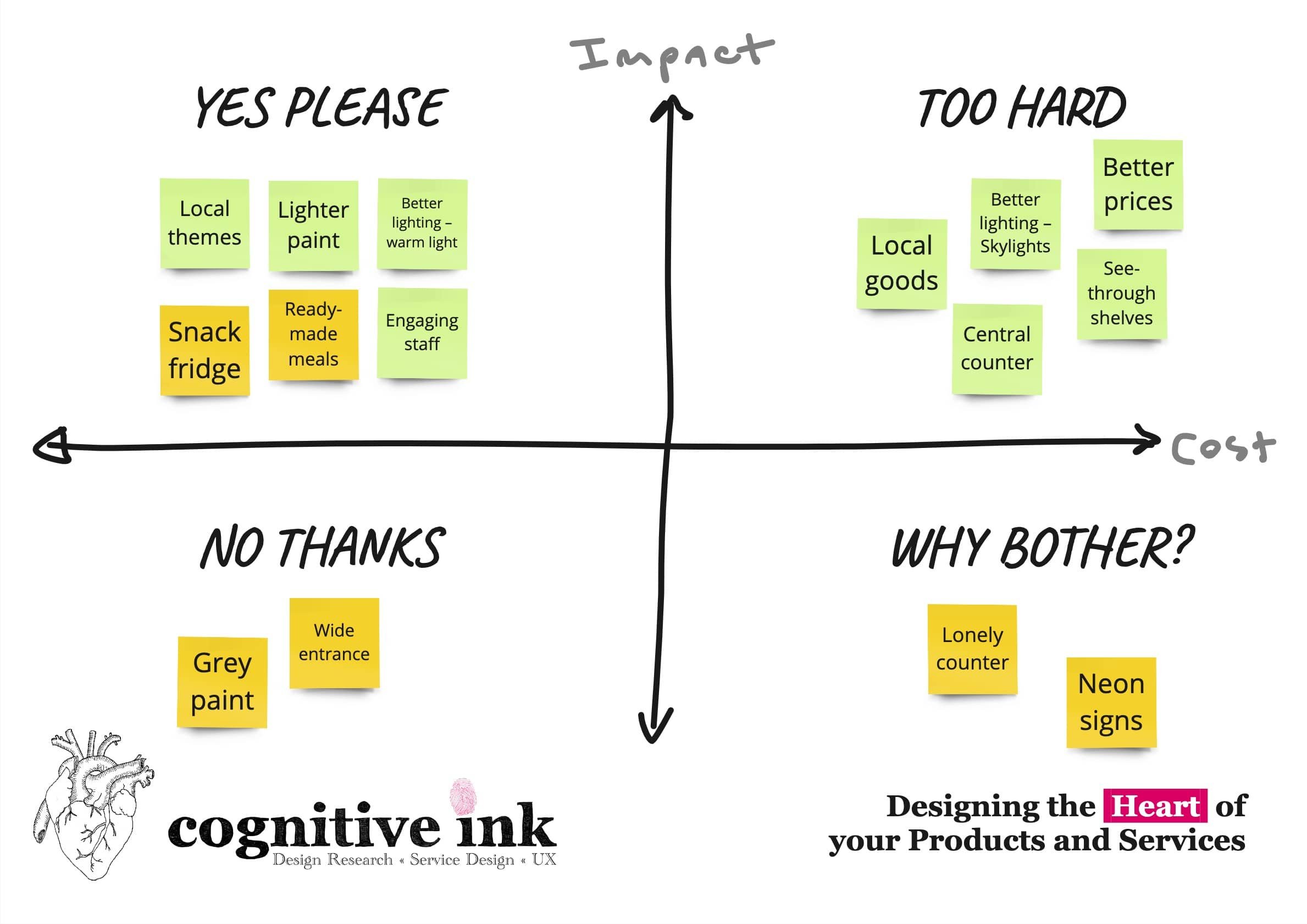
Prioritising improvements © 2023 Cognitive Ink
There’s an interesting relationship between cost and impact, with each quadrant involving different benefits and compromises.
In the first quadrant, which I call “Yes Please,” the improvements are perfect; low cost and high impact. So these improvements are the most attractive. They offer an enormous benefit and little cost, but they come with a sting in the tale, which we’ll get back to in a moment.
In the second quadrant, “Too Hard,” the improvements are high impact, but involve too much complexity or change requirements. Sadly, these are often the long-term investments that just never seem to get funded.
In the third quadrant, “Why Bother?” are the low cost and low-impact improvements. These might seem like actions not worth taking, but enough of these can lift an overall experience.
In the fourth and last quadrant, “No Thanks” are the high cost and low-impact improvements. These seem the most obvious to avoid. Oddly, these are often improvements that people take on, because they’ve mis-categorised the improvements, confusing a flashy (and expensive) improvement as something that will have impact.
Consider the store’s improvements against mine.
The store has focused on several items in the High impact and low cost, snacks and ready-made meals. They’ve also focused on improvements that I would consider low impact and high cost, like moving the counter and buying expensive neon signs. In fact, I’m proposing these have a negative impact. I’m also proposing the dark grey paint should have been a ‘No-thanks’ improvement, it has a low and/or negative impact.
I’ve focused on a few actions that I’d consider High-impact and Low-cost, like Local themes, Better lighting, Engaging staff and lighter paint. I’ve also proposed a few High-cost and High-impact proposals. These may require more investment, but create a better store in the future.
But just prioritising the improvements isn’t enough. Consider how each of the improvements fits back into the store-experience-as-a-whole…
Testing priorities against the emergent experience
Let’s start with the paint-job and neon lights. These might seem like easy wins, but consider how they interact with the lack of windows, tall shelves and bad lighting. We’ve gone from a dingy country store to an oppressive, chilly and dystopian experience. Combine these two minor tweaks with the reshuffling of the entrance and counter. The store experience is worse than it was before. The snacks and ready-made meals suit the aging demographic of the area, who might be less inclined to cook. So that is a win.
Compare this with my proposals for local goods, local theming, better lighting, skylights and see-through shelves. A lighter, brighter and more friendly environment.
Which leads me to the most profound, ‘Yes Please’ improvement that costs little.
Can you guess what it is?
More friendly staff.
The root of so many customer-facing experiences sits with the people that host/run/offer the experience. I don’t know much about the employee culture. Maybe they’re not well-selected, incentivised, well-treated or something else.
But the brisk and inward-focused attitudes make visiting a chore that no amount of change to the setting will affect.
But it’s not something you can see in the abstract. Their behaviours only make sense in the emergent context. For all I know, maybe they don’t enjoy working in the grey, chilly and neon-lit windowless cube. It’s not enough to interview them, or conduct surveys, without seeing as an on-the-ground-shopper how they interact with each other and customers.
That’s why big-box stores are so terrible to visit. The cavernous space, noise, clutter and press of people crush the people working there, turning them into emotional drones, leaving them unable to enjoy their time or offer much personalised service.
Oh, and change the paint job.
And lose the neon.